We are a small operation that spends most of our time on research and consulting people with regards to being healthy. Our business is about supplying the most effective routine of supplements available. The Fix Your Body brand is top quality without the marketing hype. The results are our goal and with a bit of time our clients are very convinced about how well they work. For research we seek large scale studies with long term followup. A study of twenty people over one month is not reliable whereas a study of 125,000 over 18 years may be credible. Sometimes a study is pre-set to prove something such as salt increases blood pressure. The study is designed to reflect the funding goal and not at all to do with science. Then a long term study finds the exact oposite to create serious confusion. The rich funding of the skewed studies are then highly promoted through the media. The real health studies are often un-promoted and lost in the noise of the hype. This is the case with coffee, eggs and salt. It is easy to study the salt called MSG and then release the findings as "salt is bad" but no specification on which salt was used in the study. This is the problem with our new label laws where sodium could be all MSG or all sodium-chloride. The health effects are worlds apart and the label was funded by the rich corporations. The sodium of MSG destroys the body while the sodium-chloride is the key immune system of the central nervous system, bone marrow, skin and lungs. Low sodium-chloride levels are seen in many diseases. The study by the Albert Einstein College of Medicine followed 7154 people for 13.7 years. They found that those who added sodium-chloride to their diet lived longer and had fewer cardio-vascular diseases. Rich corporations only sell medicines to sick people. It is difficult to bring un-biased information forward as it is so often against the slick and effective advertising and promotions of skewed marketers of medicines. Here at Rebound Health we attempt to provide credible scientific support for an informed decision about our personal choices. Some of this is mentioned in a newspaper article: a Globe and Mail article on confusions.
Recently Modified (new)
- Topic: Carbohydrates
- Olmesartan Reducing Coronary Plaque
- Nitric Oxide, Harrison's 14th Ed.
- Potent in vivo antiviral activity of the herpes simplex virus primase-helicase inhibitor BAY 57-1293
- New helicase-primase inhibitors as drug candidates for the treatment of herpes simplex disease
- BAY57-1293 claimed to cure herpes.
- BAY57-1293 active on herpes.
- Cowboy to soy boy
- Comparative efficacy: Antibiotics in Biofilms
- Osteoporosis and Salmon Oil
Most Viewed
- Taurine reduces vascular calcifications
- Statin Warning - 7 Deadly Side Effects
- Niacin - Harrison's Principles of Internal Medicine
- Topic: Carbohydrates
- Live longer; take antibiotics
- Topic: Vitamin K, K1, K2, K3 and more
- Topic: Acne that will not go away as an adult.
- Comparative efficacy: Antibiotics in Biofilms
- Viagra, a nitric oxide donor, helps fight tumors
- Topic: Breakfast Ideas
- Topic: A Biological short story
- video - Sugar: The Bitter Truth (The SHORT Version)
- Statins and anxiety
- Topic: Omega 6 Oil
- Book: Wheat Belly: Lose the Wheat, Lose the Weight, and Find Your Path Back to Health
Bryon's Articles
Bryon's papers published in magazines.
Easy to read and most have references to the technical papers.
Shop | Products
At Rebound Health, we are committed to guiding you toward a balanced and healthier life through credible science and quality products. Our focus on research ensures that our offerings genuinely support your health without the distraction of flashy marketing. Explore our essential product categories:
Explore the Rebound Brand
Fix Your Body
Natural Factors

New Roots

Now
Organika
Trophic

Taikoo
Vital Choice
Articles by Various Authors
Interesting information written by various people.
Some easy to read, some technical papers, and some medical studies.

On Rebound | Consult to Bryon
We are passionate about empowering individuals to achieve lasting wellness through informed decisions, holistic care, and high-quality supplements. Our mission is rooted in credibility, science, and years of personal experience.
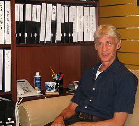
Bryon, the heart of Rebound Health, brings a unique perspective to health consulting. Growing up in Alberta, Canada, with a solid foundation in pre-med sciences, Bryon’s journey into health was sparked by personal and family challenges with chronic conditions. On Rebound, Bryon combines nearly three decades of rigorous research and practical wisdom to help clients rebuild their health and reclaim vitality through a holistic approach.
We know how confusing and overwhelming health information can be, especially when influenced by media or skewed studies. That’s why we strive to offer clarity. Our approach is grounded in credible science, holistic care, and high-quality products. We invite you to take the next step towards a healthier you by booking a consultation with Bryon. During your personalized session, he’ll take the time to:
- Understand your unique health concerns and history.
- Create a tailored plan designed to address your specific needs.
- Provide guidance on effective routines, supplements, and lifestyle changes for optimal results.
Feel free to send us an email to schedule your consultation. Rest assured, Bryon will personally review your concerns and provide thoughtful, insightful guidance tailored to your needs.
Rebound Diet™ Versions Available
Beginning in 2002 we have suggested foods that are good for health. These guidlines apply to all ages and for all people.
| Date | Version | English | Farsi | Chinese |
|---|---|---|---|---|
| 2016 - March | V.7.2 | PDF Colour | PDF Colour | |
| 2014 - December | V.6.1 V.6.1 |
PDF B/W PDF Colour |
||
| 2012 - April | V.6.0 Short | |||
| 2012 - March | V.6 Long | PDF Draft |
future | future |
| 2010 - 2012 | V.5 | 避免 PDF 增加 PDF |
||
| 2009 | V.4 | - | ||
| 2008 | V.3 | - | - | - |
| 2006 - 2007 | V.2 | - | - | - |
| 2002 - 2005 | V.1 | - | - | - |
Contact | About
New Address
Unit D, 4/F, Tai Fat Building
37 Ko Shing Street
Sai Yin Pun, Hong Kong
Three numbers:
Office: (852) 2546-0055
Bryon: (852) 6389-1479
Paul: (852) 6622-5282
Three sites:
www.reboundhealth.com, old original
www.reboundhealth.net, new construction
www.rebounddiet.com, practice, future menu / recipes
Two emails:
info@reboundhealth.com, health, orders
bryonhk@gmail.com, direct to Bryon